Global Basecamps plans a ton of African safari tours. So every time a traveler tells us they have two weeks to see four different countries on the continent, we know we have some explaining to do. Regardless of travel experience, we find that even veteran travelers have a difficult time grasping exactly how big the continent of Africa actually is. There seems to be an assumption that Africa is roughly the size of the United States and Canada… This might be thanks to this:
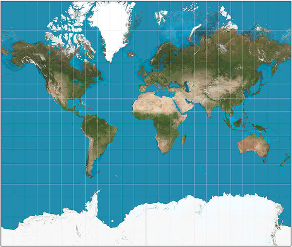
That’s a map, but it’s not just any map. Specifically, that is the Mercator projection of the world, presented by cartographer Gerardus Mercator in 1569. It’s the one many of us learn from in school. The map was a breakthrough in nautical technology for sailors navigating coasts. No map is perfect, however. This map grossly distorts the size of land masses. While the Mercator projection shows Greenland as being bigger than Africa, Africa is actually fourteen times bigger...
Here’s what James Gall and Arno Peters, two other cartographers, think the world looks like. This is the Galls-Peters projection:
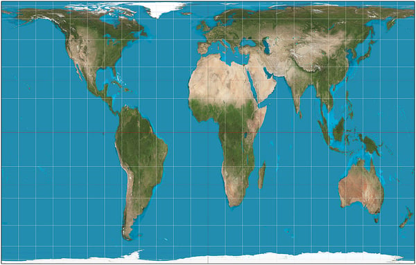
This map stays true to land mass size. Again, no map is perfect, and in cartography circles, the Galls-Peters projection elicits quite a bit of conversation. But considering how much western travelers underestimate the size of Africa, we have to give it a bit of credit. Seen on this projection, it’s easy to see how the US, China, Europe, India, and Japan could all fit snugly into a space the size of Africa. Can’t imagine that? Here:
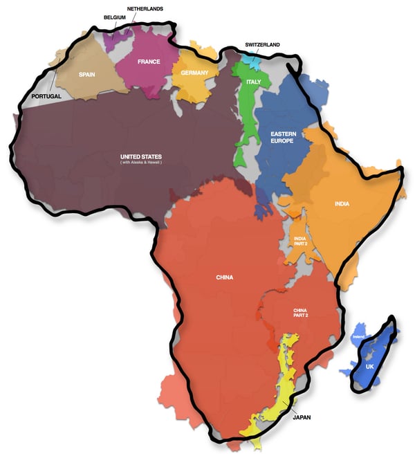
So when considering your drive up the coast in South Africa, remember that you’re traversing a region the length of California. A flight from Cape Town to Nairobi is about the same length as one from Los Angeles to New York. Chew on that!
Images via:
Wikipedia
Kai Krause - kai.subblue.com

